Does Modernism meet our current sustainability standards?
Designers may need to consider the systemic effects of their favorite aesthetic.
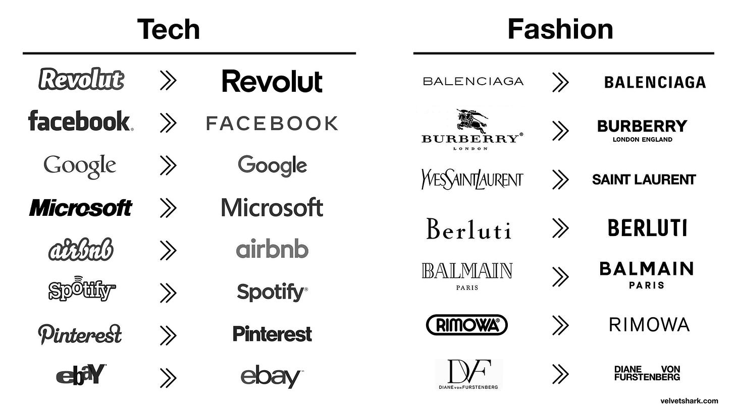
Love it or hate it, you have to admit Modernism has staying power. It has been more or less ubiquitous since the mid-20th century, aside from some backlash in the 1970s-1990s. Most contemporary branding is still a permutation of Modernism; it may be more flamboyant, but the core concepts remain the same:
Less is More.
The design is complete when there's nothing else to take away.
According to Dieter Rams, "good design"—in other words, Modernism—is sustainable; with its minimal style, that seems natural. Less "unnecessary" flourishes should mean less material used. But how true is this in reality?
Does a Modernist mindset and aesthetic help us move toward a more sustainable future? Or does it sell us a bridge to nowhere?
Credit where credit is due
I have to start by acknowledging the problems that Modernism solves well.
Because of its utilitarian focus, it shines in mass production, where physical margins and efficiency are perpetually refined and improved. Cars have become more aerodynamic, technology more miniaturized, and packaging less bulky. The full-court press on technological progress has led to incredible improvements in material well-being; similarly, the ability to connect with customers about their needs has become much more sophisticated.
Another area in which Modernism excels is "universality." It creates clarity, legibility, and reproducibility. Much like assembly-line production, it's based on continuous refining until a design is sculpted to the essential—for example, Massimo Vignelli with his six typefaces, structured grids, and fundamentalist design.
If used skillfully, this essentialism creates shared understanding, potentially leading to more sustainable outcomes: more evident designs need their functions communicated less frequently, so fewer resources are used. People can move through their day more efficiently, using their energy to concentrate on what matters.
A tail-eating snake
Production efficiencies favor linearity and consumption
While Modernism allows us to design and produce goods efficiently, the definition of "efficient" is constrained. For example, streamlining production theoretically reduces emissions, but in practice, those reductions happen because of government intervention or public pressure. Corporations rarely volunteer to internalize the costs of environmental harm because externalizing it is a prime source of profitability.
When emissions reductions do happen, they last only briefly due to the Jevons Paradox, as we discussed last week. Less is More, indeed.
The quest for miniaturization has led to unopenable and unserviceable products. Often, warranties are voided if the user even thinks about repairing what they bought, or, even worse, the products are nearly impossible for users to repair without hiring—or being—an expert repair technician. This irreparability has gotten a lot of press recently, and the EU has pushed consumers to have more rights to repair.
But even when products are reparable, minimalism highlights their flaws. Scratches draw scour, dents provoke pity, and laptops de-ionized by palm grease signal obsolescence. Our devices are best when they come off the production line, and their perceived value drops rapidly once they're used. The marks of life become a detractor more than a note of distinction, and products become passé before their time has passed.
This works in a vicious cycle with our broader cultural imperative to have the newest and best version of everything. Far from being a sustainable aesthetic, Modernism implores us to consume more. Newness gives us that oh-so-satisfying dopamine hit, but it also prevents us from feeling the complex emotions of prolonged usage. Would living longer with our products make us more aware of the lives we—and they—have lived? How would that change our relationship with the world and each other?
Universality creates monoculture
There's also a glaring problem that Western designers often overlook: Whose culture becomes the standard? With universality, culture becomes an all-or-nothing game to whom the winner goes the spoils. But what is lost when culture becomes homogenized?
Different ways of thinking go extinct, and once resilient societies become brittle. A myopic culture, so obsessed with its solutions, might even see alternative methods of designing and building as extraterrestrial. Now more than ever, we need those different ways of thinking and seeing the world.
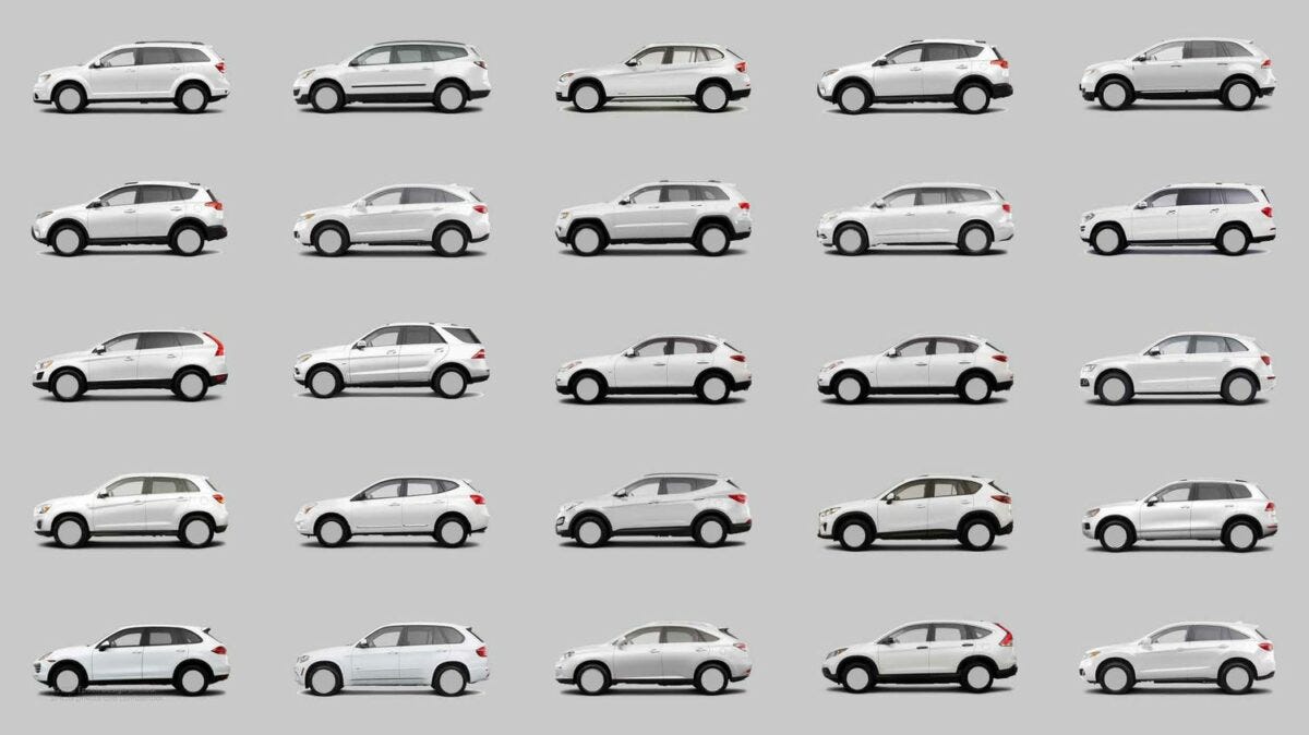
We're reaching a singularity as culture homogenizes, especially over the past 15–20 years. Many things look the same across various industries and continents—branding, fashion, architecture, technology, automobiles. Cultural "biodiversity" is dwindling. This abolition of local vernacular may be comforting if you want to feel at home wherever you go and whatever you do, but it's terrible if you want to be surprised, delighted, challenged, comforted, intrigued, or a million other nuanced emotions.
This singularity is a symptom of Modernism pushed to its extreme. A preoccupation with efficiency creates an ever-expanding search for avenues to cut costs and increase adoption. Eventually, there's no other choice. It's hard not to sell out. There's a reason "they don't make 'em like they used to."
Can Modernism, in turn, be seen as a symptom of the nearly universally loathed capitalist growth imperative? And is our compulsion with that aesthetic caught up in the idea that, as Mark Fisher says, "it's easier to imagine the end of the world than the end of capitalism"?
Back to the future, not a return to forever
Seeing the Modernist forest for the trees doesn't necessarily lead us to a way out.
Likewise, an exit won't manifest by simply reverting to the past; we have to combine lessons from history with critiques of the present to create a new narrative that carries us forward. This change will first come from each of us individually, then collectively. It will demand new vocabularies: social, business, and, of course, visual.
We can design objects for their "growth value" rather than exchange value, welcoming the luster of extended use—which was the norm from the beginning of humanity until the 1950s, before the arrival of mass production. In a way, the quest for efficiency and reproducibility squeezes the last bits of humanity out of our products. The fingerprints we used to recognize as those of a craftsperson became those of a machine and, more recently, of software.
In Design for Resilience, Stuart Walker sums this up nicely:
Design should certainly learn from and reference the past and build on earlier contributions to the discipline. Moreover, this does not have to be done in ways that are always novel and original; such contemporary preoccupations can themselves be criticized as being part of a system that constantly promotes newness and innovation in the name of progress and economic growth; a system that is clearly highly damaging and grossly unsustainable. ... [T]hink of the provenance-revealing features of a building that has been repaired, added to, and repurposed over time, or the patina of a well-used wooden chair, kitchen table, or hand tool. These aesthetic qualities emerge from context and culture, and consequently such artifacts often have a unique and satisfying “fit” with place, an “at-homeness” that is a function of time, chance, tradition, and enduring use.
These qualities of "fit" and "at-homeness" emerge with time and respect for the design's original concept. The idea of improvement over time contrasts starkly with newness, which, as we've seen, generally breaks down or gets worse over time.
How can we create future-oriented designs that embrace this concept, reduce waste, and change cultural stories of need, desire, and sufficiency?
Maintenance can be a point of resistance that creates personal independence and physical connection because it leans into what Ruben Pater calls the "Hacker Mentality." In CAPS LOCK, he quotes Anja Groten, who says it "is a way to emancipate users of technology from being passive consumers to becoming critical makers."
Some brands are beginning to make repair-only stores. This is a good start, but it still generates proprietary, producer-consumer relationships—much like utility companies trying to own the solar grid instead of allowing personal, distributed solar installations that would enable us to sell our excess energy back to them.
How can we design products, brands, businesses, and services that restore or augment the user's autonomy instead of co-opting it?
We can also design to minimize scars rather than highlight them. I don't mean creating a medium-tone world where you don't know if something is dirty or just a perfect shade of PANTONE® Ultimate Gray. Somehow, our cultural singularity has already brought us that. Instead of working against time, we could work with it by investing in different materials, patterns, and textures that let us embrace faults, glitches, and imperfections as signs of individuality rather than character defects.
This requires a different outlook on what design is and who it serves. It would be a design informed by transcultural understanding and longevity, not mood boards and short-termism. One built on a library of feelings instead of already-produced references and reinforced by a political perspective that our industry has abdicated for decades. These concepts could help us understand the implications of our designs beyond their market value and quarterly earnings.
How can we incorporate the passage of time into our designs rather than suck it out of them?


